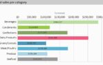
Sounds complicated but is quite intuitive to use. So without any further ado, this is what it can look like to visualize the total volume of sales per category:

However, this chart only shows one level. The share of each category is represented by its area and it’s easy to see that the Dairy Products do best while Grains/Cereals sales could use some boost. Setting up a chart like this is easy – just select the new treemap type from the dialog and choose the category name for the x- and the sum of product sales for the y-axis. A little tweaking for the coordinate text (templates are automatically provided) font size (just choose hilarious 142 pt, we’ll do the actual sizing for you) and the frame lines later, and you’re done.
The real fun starts when further looking “down” in your data. Nested rectangles really can be nested ;). So instead of just looking at the categories, let’s look at the products as well. Simply use the Multi-Row flavor of the new chart type and set the product name as value for the additional axis. The result is this:

As you can see, the chart can get quite crowded with data. A tooltip makes sure no data is lost or invisible. If you prefer, you can also use a drilldown report to “zoom in” one level by using the drilldown via our report parameters feature, which also works for treemaps, of course. If the target report contains another treemap, you have a very powerful data analysis tool, built in a couple of minutes using this new feature.
See this animation for a primer on what’s possible – from the category you can zoom into the products and from there into the customers to see who bought all this Côte de Blaye everyone’s talking about:

Another handy way to keep the chart sane is to restrict the number of boxes and only display e.g. the top two products alongside an aggregated view on the others:


Leading the development at combit as Managing Director. Microsoft .NET enthusiast driving innovation & agile project management. Used to be a physicist in my first life. I love hiking and vanlife.