Enhanced Drag & Drop Support in the Designer

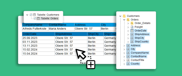
A frequently asked question was: “Why can’t I see the relations in the report designer?” This question refers to the variable/field window, in which 1:1 relationships were displayed, but not (the usually much more important) 1:n relationships. In short, our answer was always: “The relations are there, but only in the object window, e.g. when creating tables”. We even put the long answer in a Knowledgebase article.

Service Pack 28.001 for List & Label and the Report Server

This is a summary of the major new features and improvements in Service Pack 28.001, including new export features and bar charts for the Web Report Designer. For a detailed list of all changes, see the ServicePack.pdf in your installation or in the Service Pack download section.

Creating Charts via Drag & Drop

Drag and Drop for Donut Chart

List & Label’s chart dialog offers a load of possible customizations. However, as always, with great power comes great complexity. Even creating a simple pie chart could have taken some time if you’re not yet familiar with List & Label’s chart features. As you can already easily create crosstabs via Drag & Drop, and we just recently improved the table’s drag & drop features, offering a thorough D&D support for charts was the next logical step on our path to a simpler, more intuitive end user desktop designer.

Powerful, Reusable Subreports for Your Reports

Often reports consist of similar, repetitive sections like a number of charts or crosstabs just filtered for different categories but otherwise identical. Or tables and subtables that have a preselected set of columns you want to have wherever this table is used. List & Label 26 now helps you and your users to get rid of the tedious task to maintain such reports and apply changes to all instances of objects. You can add real subreports that contain exactly the required items and maintain those in one single place.

Use Rscript Visualizations for Your Reports

While List & Label's charts offer a lot of visualization types and are extended almost every version, there are way too many visualization types to support them all. Thus, requests for new chart visualizations keep bubbling up in our feedback portal. On the other hand, Rscript is a well established language specialized for statistical computing and graphics that supports any visualization I can think of. So it absolutely makes sense to add Rscript output to the available chart visualization and include the best of both worlds – List & Label's versatility for report layout and data access and Rscript's deluge of visualization types. And that's just what we did for the Enterprise Edition of List & Label 24.

Vastly Improved Chart Rendering in the Browser

divided pie chart in LL23

Over the years, we kept improving our chart engine with each version. We've added Donut, Radar and Treemap charts and offered new layout options. However, if your charts were to be rendered in the browser, the only available formats so far have been PNG or JPEG, leaving you with exactly two options: either have great quality and huge file sizes or a swift download and poor rendering quality. There was no option to combine both (and I'm not thinking "huge download and poor quality" here <g>). In LL24, this is going to change.