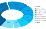
For a quick walkthrough, let’s start with a simple pie chart in our demo application – the distribution of customers by country. Simply drag the Customers.Country field to the workspace and drop it there.

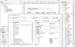
This brings up the following choices:

Note the last entry, which is new to List & Label 27. In the next step, you choose the chart type directly in the workspace:

As we’re happy with the default for this case – that’s all. The preview shows the result:

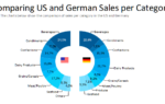
As a more complicated example, let’s compare the sales for the different regions EMEA, NAFTA and APAC through the years. To create this, just drag Sales.Year and drop it on the workspace. Choose “Bar” and “Clustered”. As we already have aggregated values in the EMEA, NAFA and APAC fields of the database, we want to create the values by series. So let’s choose this.
Now, simply create the series by dropping the APAC, EMEA and NAFTA fields into the designated area. After that, here’s what the workspace looks like:

Of course, you still need to tweak sometimes – as for example, the years have two digits here, as they aren’t integer fields in the database. Of course, the dialog with all its properties is always still available to the rescue. Simply double-click the chart to bring up the dialog. Take note of the new, (hopefully) helpful tooltip while you’re there:

We’ve added these to a number of places to highlight often overlooked features. You can immediately apply this new knowledge and click on one of the year labels in the dialog’s preview, in order to get to the coordinate value and edit its format property:

Which (after doing the same tweak for the y-Axis) results in:

I’m pretty sure this new feature makes the creation of your charts much easier and intuitive. As always, looking forward to your feedback.

Leading the development at combit as Managing Director. Microsoft .NET enthusiast driving innovation & agile project management. Used to be a physicist in my first life. I love hiking and vanlife.