Key figures are often calculated and displayed from which no conclusions can be drawn. As with presentations, the same principle applies: less is more! In addition, there are some other basic design rules. If you take these into account, the result is a dashboard that is both visually appealing and offers real added value.
1. Determine Target Group
To display the really relevant data, you must first define the target group precisely. A graphically appealing dashboard is not an end in itself. If it presents too much data, if it is not relevant for the target group, or even if it is outside the competencies, it is counterproductive. Too much and not relevant data distracts from the actually interesting information and thus complicates the gain of knowledge instead of simplifying it. If, for example, you show how long visitors stay on individual pages of your website, which is the last page of the visit and which pages are quickly skipped, this is relevant for the marketing department. Support is more concerned with questions such as “How high is today’s support volume?”, “Are all reported queries already distributed or are there still unallocated tickets?” The IT department, on the other hand, is more interested in server utilization.
If this step is skipped, dashboards with data from different departments are created – true to the motto: “because I can”. An efficient dashboard, on the other hand, is always aimed at a specific target group and displays only the data that is relevant to that target group.
2. Data Selection
Here one should ask oneself which quality of the data is needed to answer the defined question, since the data represent the basis for an optimal visualization.
Comprehensibility
The key figures shown must be presented in a simple and understandable way for the selected target group. A dashboard created for nuclear physicists will probably not tell the sales team of a medium-sized company anything.
Comparability
Ideally, data should be compared over time or related to an industry standard or benchmark. The dashboard makes it easier to compare the data. This makes it easier to draw a conclusion from the key figures. For example, compare support cases that have occurred in the current year with the same period of the previous year. Do you need more support staff? Has the quality of the product to be supported deteriorated?
Format
For those who are deeply involved with the matter, absolute numbers, especially when they are very large or small, can be helpful. Indicators or relations place numbers in a larger context. The absolute number of visitors to the company’s website may tell an employee in the marketing department something. But only the percentage comparison with the previous month or the previous year’s period classifies the number meaningfully and allows an evaluation.
Timeliness
If an outdated dataset is displayed, the dashboard is useless because no or even wrong conclusions are drawn and therefore too late or wrong decisions are made. Therefore, the status of the data should always be displayed. The dashboard as a decision-making tool usually requires up-to-date data. Depending on the application, monthly or weekly updates are sufficient, but often daily updated data or even real-time data is required.
3. General Design
Use colors, shapes, lines in different thicknesses, shades and others sparingly in the design of your dashboard. Avoid exaggerated artistic widgets, 3D graphics, and unusual chart shapes. Bar charts, line charts, heatmaps, and scatter charts are popular because they present information clearly and comprehensibly. Make your dashboard as simple as possible to underline the purpose of the dashboard: fast and easy information transfer.
Pictures and Logos
A dashboard with your own company logo certainly looks very good. But do employees need to be told which company they work for? (Background) images and logos that have nothing to do with the key figures displayed do not contribute to the information content. Unsettled pictures can distract from the essential key figures and thus favor misinterpretations by the reader. Therefore, decorative images and logos should be used sparingly.
Use of Colors and Fonts
Use colors correctly! Use the same colors for the same meaning. A color scheme brings the same colors into different representations. The user remembers colors and their meaning. If the colors in the next picture are used completely differently, the evaluation can be misunderstood. The effort to create a concept for colors and fonts gives your dashboard a tidy and consistently calm appearance and is therefore better perceived.
Colors
For example, do not use bright or gaudy colors for bar charts. This representation over-excites visual perception in confined spaces and confuses viewers. It is better to choose a color scheme that contains matching and coordinated colors. You should keep this scheme within the dashboard. Graphs are best readable when displayed in different shades of gray. Use signal colors sparingly and only when you really want the content to be highlighted. Avoid bright colors, as they unnecessarily emphasize the data and thereby falsify the interpreted result. Exception: If the key figures can be meaningfully classified according to their meaning, you should fall back on unique and familiar colors. For values that have a positive meaning, use the colors green or blue. Yellow is suitable for “OK/Satisfied”, and red or orange for bad values. But even with such a traffic light display, a softened or soft hue is often sufficient.
Fonts
Choose a font that is easy to understand and recognize with a clear font image, and that is used throughout the dashboard. Some markers should only be used when absolutely necessary. For example, underlining is known as a marker for hyperlinks and should therefore be avoided. The same applies to bold and italics. The target group should be able to recognize the structures clearly and not be distracted by many markings.
3D Charts and Animations
3D charts usually do not lead to a better understanding of the data. Although they look spectacular, they easily distract from the core message of the chart. The same applies to exaggerated animations.
Labels
Avoid too many descriptive texts or excessive labels above or on charts. Reduce this to an absolute minimum.
Separation Lines
Separation lines (vertical/horizontal) between individual elements in dashboards are often used. However, too frequent use can easily distract from the statement.
Show or Better Summarize Granular Details
Large numbers in dashboards are difficult to read and difficult to compare. Shorten larger numbers, depending on the target group: The board almost certainly doesn’t want to know the full cent amount of sales. Write here instead of 1,254,475.67 € simply only 1.25 million €, which is clearly superior in terms of clarity and fast collection.
Often values and/or categories can be summarized meaningfully further or grouped. For a globally operating company, a sales trend for each individual export country in a bar chart is far too extensive. Instead, use DACH for the German-speaking countries Germany, Switzerland and Austria, for example. Or you can summarize the individual export states continental or in the often used world economic areas EMEA, NCSA and APAC.

4. Charts
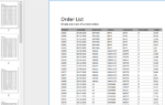
In order to be able to accurately record the statement “The turnover this year amounts to € 7,365,789.95 – last year it was € 6,954,147.39”, a short flyover is not sufficient. Such statements therefore do not belong in a dashboard. The information on the dashboard should be able to be captured quickly and easily. Reports and tables with a lot of text and individual data only confuse the viewer. In contrast, a picture often says more than a thousand words. An efficient dashboard therefore usually consists of well-ordered charts as the main component.
- Wherever possible, use visual elements such as charts and gauges instead of tables or long texts.
- Sort values in bar charts chronologically or by size as needed. This makes them easier to interpret than unsorted ones. Information can no longer be lost and comparisons can be made better.
- Concentrate on the required key figures. Combine the other values into one value to highlight the more important ones.
- You should avoid a pie chart with more than six values. The more values there are, the more difficult it is to see how the values relate to each other.
Use Suitable Visualization
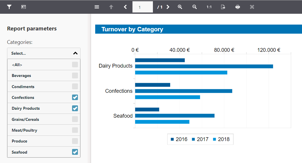
Due to the large variety of different charts and gauges, the designer’s enthusiasm for experimentation quickly leads to heavily overloaded displays. Percentages can be easily captured in a pie chart. For a single number that should move within a range, a tacho-like display is well suited. If the focus is on the temporal development of a key figure, e.g. the sales development of the past ten years, line or bar charts are very suitable.

Perception
Data visualizations are perceived differently. Common behavior patterns have emerged that influence readability and should be taken into account. Time units such as days, months, years, etc. are usually read in ascending order from left to right and must therefore be sorted and positioned on X-axes. The corresponding values, such as the turnover for a product or export country, are then normally displayed on the Y-axis.
5. Handling Detail Data
Usually, a dashboard consists of a page that displays information specifically tailored to the target audience. However, it is often not possible to separate the target group as strictly as you would like. There are also always some curious or highly motivated viewers who simply want to delve deeper into the data. Interactive dashboards with drill-down capabilities or applicable data filters give these users the option to perform simple analyses directly in the dashboard.
Drilldown: Top-down and Bottom-up
Drilldown reports, also known as top-down or bottom-up analyses, allow users to dive into the depths of the data displayed. Example: The dashboard shows sales statistics over the last three years. If you also want to know how the respective annual sales are distributed among the individual products in a category, you can answer this question with a detailed report. Usually, this is done by clicking on the desired data area.

(Report) Parameters and Data Filters
Looking at data with a lot of information is exhausting. Are you really interested in the sales data of all categories? Or would you like to have a closer look at individual categories? The dashboard is intended to show important data that is valuable for drawing conclusions. Therefore, a “rough” data filter is often used first. The user should be able to quickly adapt or filter the data according to requirements. So-called report parameters or filters directly in the dashboard are suitable for such a data selection.
6. Feedback and Updates
Respond quickly and comprehensively to changes! With the acceptance of the dashboard by your target group, its benefits stand and fall. Feedback from your users will help you:
- Are the figures/data still necessary or already superfluous?
- Are further values or key figures interesting?
- Does the data still fit the target group?
7. Availability and Access
Your dashboard should be quickly and easily accessible. It is designed to summarize important data. Customize dashboard access to the target audience and their general workflow. When dashboards are analyzed in collaborative meetings, access takes the form of a targeted presentation. If the target group is spatially separated, the report must be accessible centrally (Internet, Intranet/Wiki etc.), optimally from the most diverse devices such as notebooks, tablets and smartphones.

Daniel has undergone training as a software developer at combit, where he currently leads the Customer Support department as a manager. His responsibilities extend beyond software development to include technical collaborations with business partners. He conducts workshops for developers and serves as a technical advisor to the sales and service team. Outside of work, Daniel is an avid cyclist, frequently seen navigating the trails around Lake Constance and the neighboring Alps on his mountain or road bike. Additionally, he dedicates time to practicing Chinese martial arts, including Wushu Kungfu and Taichi.