Interactive Reports with List & Label

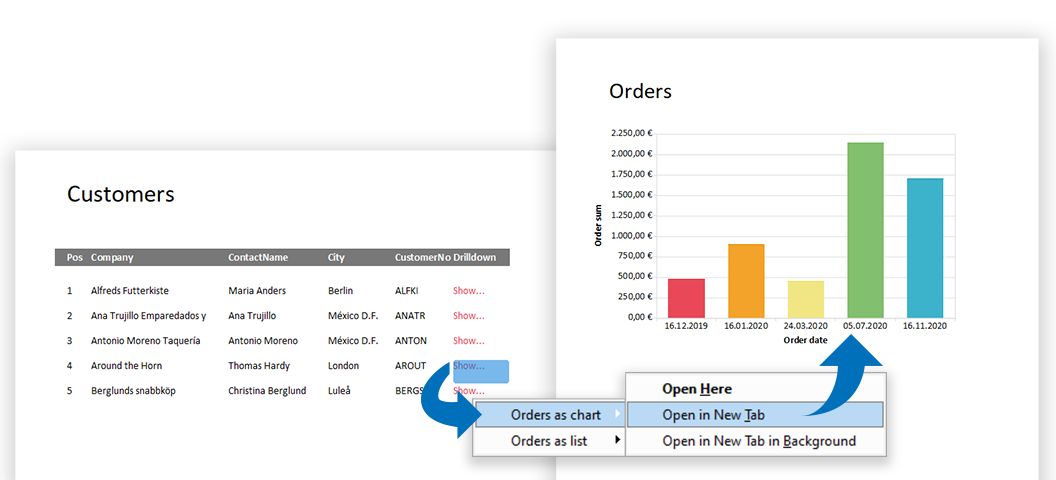
Today, modern reports must be designed for more than just one purpose. In addition, "all" data should be contained as simply as possible – but presented in a clear and structured way. With List & Label such multifunctional reports can be easily realized. Interactive elements allow a single report to cover several scenarios, while selection options further enhance the report. This makes reports more comprehensive and informative and can be easily operated by the user.

Adding JSON to the Available Export Formats

json order list

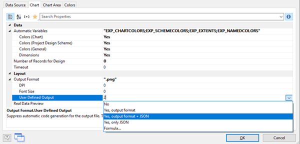
List & Label has supported a number of text based export formats for quite a while. You can have XML, CSV and layout TXT export in different variants. That way, you can use List & Label as a convenient way to convert your data from one of the supported data sources to something you can use in other applications again. But one very popular format was missing so far that's been around for quite a while: Java Script Object Notation aka JSON.

Adding Signature Support to the Email Module

This has been another great suggestion from our community at Idea Place. While the mail module is quite flexible and can send mails via SMTP, MAPI and XMAPI, and can either use the client's mail dialog or a custom, built in dialog, there was no way to append Outlook standard signatures to the sent mails so far. Microsoft has finally declined the request to add this feature to Outlook's MAPI implementation. So there was room for improvement.

Infinite Pages for HTML and XLS Export

This is another of those "huh, you didn't have that before" features. As a WYSIWYG layout oriented reporting tool, the page has always been king for List & Label. While this is nice in many circumstances, when it comes to reporting for the web or XLS and printing is not planned at all, the result can be unwanted although looking beautiful.

Create Functional Dashboards in Seven Easy Steps

Complex data is usually processed visually in dashboards in order to be able to capture trends, outliers or up-to-date data at a glance. The design of dashboards depends on important details. These details make the difference between whether the information is interesting for the target group and whether conclusions can be drawn from it or not. For example, a bar chart is better to capture than to work your way through hundreds of table entries. Dashboards are often used incorrectly and are hopelessly overloaded with numerous different charts and gauges, such as traffic lights, speedometers and hardly readable tables.